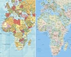
For nearly five centuries, humanity has stared at a lie rendered in ink and digital pixels. When the United Nations General Assembly considers a resolution to formally phase out the traditional Mercator projection in favor of proportion-aware alternatives like the Equal Earth map, it is doing far more than updating geographic reference points. It is attempting to correct a foundational visual bias that has quietly distorted global perception since 1569.
The primary driver behind this push, spearheaded by Togo on behalf of the African Union, targets a fundamental geometric flaw. The Mercator map was never meant to be a portrait of the earth. It was a navigation tool for sailors. By stretching meridians to preserve straight-line compass bearings on a flat sheet of paper, Gerardus Mercator inadvertently inflated regions near the poles while shrinking landmasses clustered around the equator. Read more on a connected topic: this related article.
Africa sits squarely astride the equator. Consequently, standard classroom and digital map layouts render the entire continent as roughly equivalent in size to Greenland, even though Africa is fourteen times larger. You can comfortably pack the United States, China, India, Japan, Mexico, and substantial portions of Europe inside African borders with room to spare. Yet billions of people grow up viewing the world through a lens that shrinks the Global South into geopolitical insignificance.
Cartography has never been a neutral science. Every flat map of a spherical globe requires mathematical compromise, sacrificing true area, accurate shape, correct distance, or proper direction. Choosing one projection over another is an institutional decision about what, and who, matters most. More analysis by Associated Press delves into related perspectives on this issue.
The Mathematics of Distortion
To understand why this United Nations initiative carries weight, look past the political rhetoric and examine the underlying math.
A 3D globe cannot be flattened without tearing or stretching something. The Mercator projection chooses to preserve local angles, which distorts scale catastrophically as latitude increases. Finland looks massive. Indonesia looks microscopic. North America and Europe dominate the visual weight of the northern hemisphere, anchoring an unconscious mental model of northern supremacy in global affairs.
Alternative equal-area projections, such as the 2018 Equal Earth design or older variations like the Gall-Peters, reject this geographic inflation. They trade away pristine continental shapes at high latitudes to ensure that a square centimeter of paper or screen represents the exact same physical land area anywhere on Earth.
Transitioning global standards away from Mercator creates immediate friction for technology companies and educational publishers. Web mapping applications rely heavily on standard web mercator tiling systems for efficient rendering and smooth zooming at street level. Shifting global visualization paradigms requires rewriting codebases, updating textbooks, and retraining generations of users who instinctively associate physical size with global importance.
Critics of the UN resolution often argue that maps are trivial administrative artifacts compared to economic policy or security agreements. That argument ignores how deeply visual framing conditions human behavior. When children study a map where Europe dwarfs Africa, they internalize a hierarchy of scale. That hierarchy influences foreign aid distribution, trade negotiations, and mental models of international development.
Institutional Inertia and Digital Realities
The resistance to changing how we picture the world stems largely from institutional laziness rather than technical impossibility.
Global software pipelines, maritime systems, and flight path trackers are hardcoded to legacy coordinate systems. Google Maps, Apple Maps, and open-source GIS platforms use projections optimized for screen performance and local navigation rather than continental truth. If the UN General Assembly passes a non-binding resolution encouraging the adoption of equal-area standards, software architects will face mounting pressure to build dynamic view options that prevent equatorial compression.
Geopolitical analysts note that this campaign is fundamentally about narrative sovereignty. African nations are asserting control over how their physical and demographic weight is communicated to the international community. With a burgeoning youth population and surging economic potential, the continent's real-world influence matches its true geographic footprint. Keeping it visually stunted on global dashboards is an anachronism that modern governance can no longer justify.
The debate also highlights a broader tension within international bodies. Resolutions passed in New York do not automatically rewrite local school board curricula in Kansas or software defaults in Silicon Valley. UN declarations lack enforcement teeth. They serve instead as moral and normative levers. They give domestic ministries and international NGOs the political backing required to demand upgrades from tech vendors and textbook publishers.
Changing a map will not eradicate structural inequality, alter debt burdens, or solve climate vulnerability. Symbols matter only to the extent that they shape the policies of those who wield power. But when the baseline visualization of our planet stops lying about who occupies the most space, the mental architecture of international relations shifts just enough to force a reckoning with reality.
The lines we draw on paper eventually become the boundaries of our ambition. For centuries, the world has looked at a shrunken Africa and governed accordingly. Fixing the projection is simply the overdue process of catching up to the truth.


